The last iteration of my photography site was the second website I had ever developed. It looked alright, but it was definitely a little fragile and nigh impossible to maintain.
I've been working on building a store for my photography site as a learning project for AngularJS. I'd like to eventually integrate this into my photography site, so now seemed like an opportune time for an overhaul.
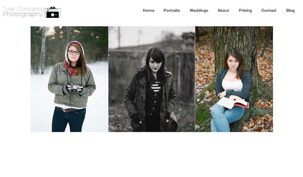
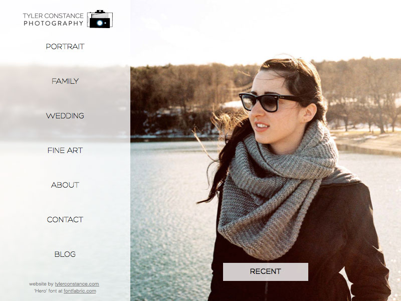
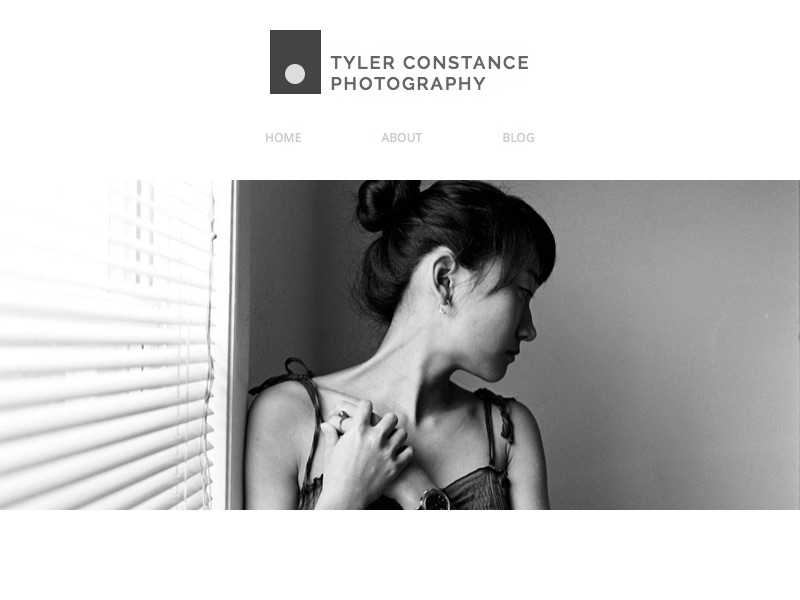
For nostalgic purposes, here's what Tyler Constance Photography has looked like throughout the years:
In my sophomore year of college, I used a side-scrolling Wordpress theme and used it pretty much out of the box. Remember when side-scrolling was a big thing?

Two years later, I had just begun learning web development, so I reimagined my photo site as a learning project. It looks good, but the CSS was "creatively" written and difficult to maintain, and after moving to Maine from New York, I stopped looking for photography work, so nearly all of the links on the sidebar went to pages telling the user that pricing wasn't up. Not an exceptional experience.

Finally, the most recent version is the simplest, but with the flexibility to expand if I decide to add a store or begin accepting clients.

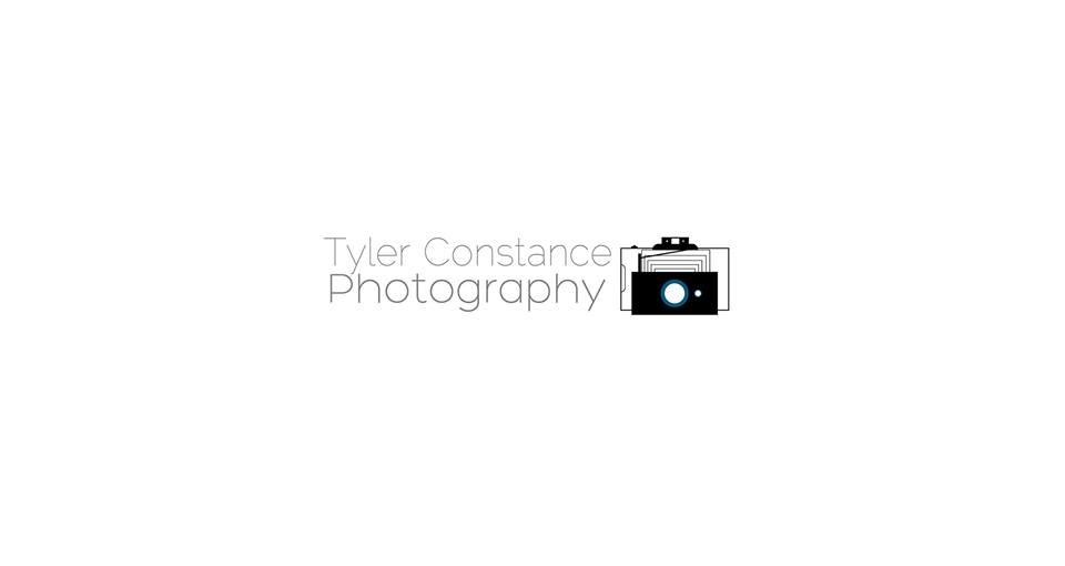
As you may have noticed, I also re-imagined and simplified my logo. At a fundamental level, cameras are only boxes that let in light – why clutter things?
And here's the old logo for comparison:
So, check it out, and follow me on Instagram!

